 A few screens from the current inventory management system
The inventory management system is used in stores and warehouses to count and correct stock. Users brought to light that some parts of this system don’t work as intended and need improvement, while other parts have become almost unusable as the system has changed over the years.
The goal is to rebuild the inventory management system to reduce the time it takes for users to complete their tasks and to improve the user experience.
A few screens from the current inventory management system
The project was initially set up because the parent stock analysing system was being reworked. This change had some impact on the users, so to make sure it all went well I accompanied a colleague in the store and walked a day in his shoes using the current inventory management system. During the process, we walked through every possible scenario that could be encountered while I interviewed them and took notes.
Based on the notes I took in the store I listed all the pain points and potential opportunities. I visualized these and walked through them with the stakeholders who had been overseeing the new system.
One of the most significant findings was that users in the store had printed the barcodes of numbers on a piece of paper to scan. This was easier than using the existing system to enter a quantity on their device during the inventory.
 Empathy map that I created based on my research in the store
I discussed my findings with the stakeholders, who explained to me the reasons behind certain design choices and what their original intention was. I noted that some of these elements were outdated or not thoroughly tested during implementation which gave us room for significant improvements to the system.
Users lose a lot of time due to accidentally making mistakes, fixing them, and scrolling through irrelevant information. To address this issue, I worked with stakeholders and users to review all the elements displayed, and created a list of elements that were not relevant to the users.
I then examined the process of entering a quantity during inventory. Users were required to manually enter the number, with the intention of ensuring that users would actually count the items, instead of simply pressing a button. The system to enter a number was not user-friendly and caused alot frustration. The input field would be hidden beneath the keyboard, and the button to proceed would only appear after they tapped out of the keyboard and scrolled all the way back down on the page.
I went a step further with this and explored the option of not even having to enter the number but simply validate the number, that is already in the system. Differences would be indicated by pressing a - and + button to increase or decrease the stock. This would cover almost all situations and every mutation that would take place, while improving the ease of use and retaining the old system of typing in the number.
Users also spend a lot of time in the store fixing these errors. Many of the errors arise because a product was not present on the location where it was supposed to be. There was no easy way to see where the actual location of the item was. Some users did not have the permission to easily search for it, and the users who did have permission ended up on a page that was not designed for mobile devices. Forcing them to waste time scrolling through broken pages or having to walk to a computer on the other side of the building.
To find a solution I sat with the store manager and we went through the data looking at the origin of the errors and how they could be fixed. This showed me that most of the time an error occurred, it was because items were misplaced in the store or incorrectly labeled within the system.
As a solution I decided to show every location of an item where the system things they should be. This could for instance be items that were returned, or items that are part of an order that was already picked. This would enable them to quickly analyse the counting error and fix it themselves, instead of submitting it and having someone else analyse it all over again later.
Next, I created mock-ups for possible solutions and shared them with stakeholders to come up with a design.
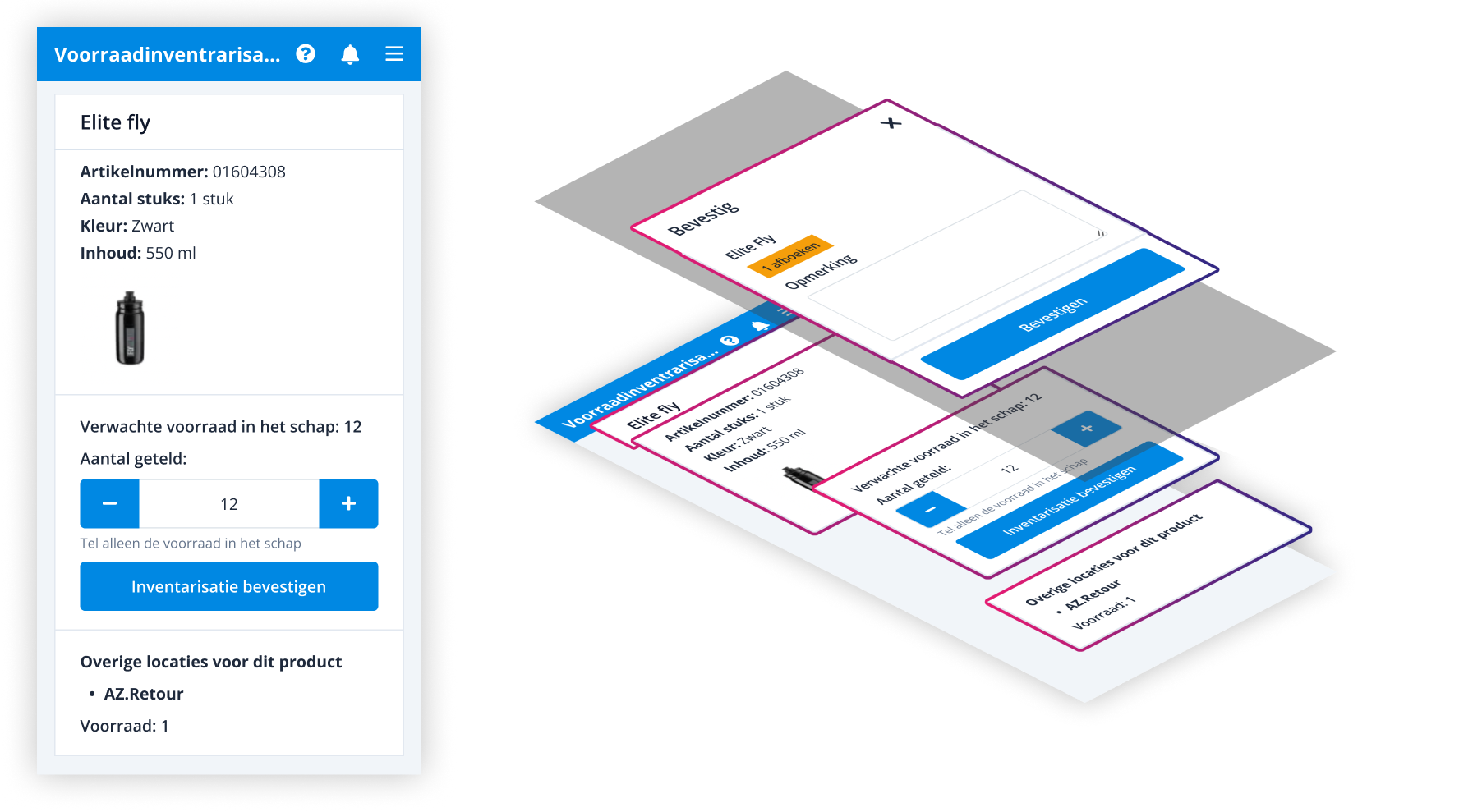 The design mockup for the new system
To validate the design, I had a store employee with extensive experience test it. Based on the results, I concluded that removing the confirmation screen and pre-filling the quantity, significantly improved the workflow and provided a better user experience. In addition, displaying the locations of products reduces errors during inventory counting, which also saves a lot of time for employees.
 Figma design for the new system
The positive feedback on this design led to the decision to also implement these solutions in other systems related to stock counting like the one in the warehouse.